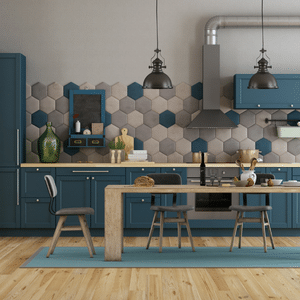
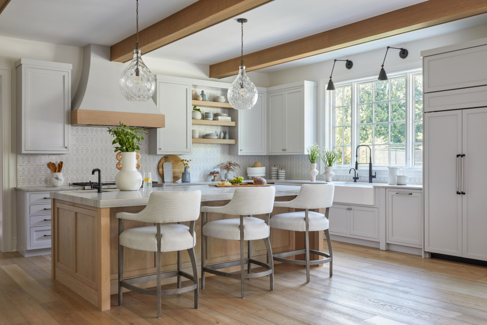
Follow the Retro Trend with These 4 Mid-Century Modern Countertop Ideas

The timeless look of this style has endured for decades, thanks largely to the fact that it retains a contemporary feeling. As of recent, it has become increasingly popular in interior design trends, sparking a resurgence in modern homes.
Whether you have a mid-century home or you simply want to incorporate elements of this eternally popular style when you upgrade your kitchen, here are four ideas for choosing the mid-century modern countertops that will complement your design.
#1: Clean Lines
One of the most prominent hallmarks of mid-century modern design is the lack of ornate embellishment found in design styles of previous eras. Clean lines and a streamlined aesthetic dominate this aesthetic.
In kitchen design, this translates to a number of rather specific trends, such as flat-front cabinets, open shelving, and geometric elements. This enclosed mid-century kitchen serves as an ideal example of all three.
Flat-panel cabinetry in a warm, medium-tone wood creates a streamlined appearance but stands out against white quartz countertops, a white porcelain backsplash, and white and gray porcelain tile flooring.
Open shelving punctuates the expansive space at the far end of the kitchen. Geometric tiles (hexagonal and circular) add an orderly feel to the floor and backsplash, creating visual interest not only with pattern, but also with color variation and a three-dimensional texture.
This modernized mid-century kitchen offers another great example of the clean lines the style is known for, featuring medium-tone, flat-panel cabinets that add warmth to gray tile floors, a black quartz countertop, and white backsplash tile.
In both kitchens, the countertops showcase the simple, sleek appeal of mid-century design and stick to a neutral color palette, but add visual interest with colors that stand in contrast to the surrounding elements.
#2: Color Juxtaposition
A mixture of muted tones with vibrant pops of color is not only a great way to bring personality into your kitchen, but it’s a standard practice in mid-century modern design. How can you make this work in a kitchen space?
Generally speaking, you’ll want foundational pieces like flooring, cabinets, and countertops in neutral shades so you can accent them with brighter, more vibrant colors on paint, furniture, and accessories, as is shown in this 1960s mid-century modern kitchen.
The countertops, in what looks to be a pale gray quartz, stand out against flat-front lower cabinets in a dark wood tone. Both are neutral, but the contrast creates a sophisticated design.
The tableau is elevated by the use of geometric backsplash tile. Not only does the cube pattern boost visual interest, but the jewel-toned teal of the tile, with variations in color ranging from lighter to darker, creates an eye-catching focal point behind the range, the hood, and the white upper cabinets.
You can, of course, go a bit bolder by adding colorful cabinet fronts, as seen in this 1950s kitchen remodel. Walnut cabinet frames have been accented by laminate doors in lime green and sky blue. Paired with lighter, blonde flooring and countertops that look to be glossy, white quartz, the overall effect is surprisingly cohesive and incredibly eye-catching.
#3: Pairing Natural and Manmade Materials
Bringing natural materials into a space is an important aspect of mid-century design, but equally important is pairing them with modern, manmade materials in creative and appealing ways. Take, for example, this expansive mid-century kitchen.
White oak flooring and flat-panel cabinetry in a heavily grained, medium-tone wood represent natural elements, while upper cabinets in white laminate serve as a synthetic counterpart. The countertops in Blizzard White Caesarstone offer a bit of both, thanks to natural quartz content of up to 93%, all bound with polymers and resins to create a non-porous, low-maintenance surface.
#4: Bringing the Outdoors In
One of the guiding principles of mid-century modern design is the marriage of indoor and outdoor spaces. Noted architect Frank Lloyd Wright was renowned for his ability to tie his designs into the surrounding landscape, as with famous structures like Fallingwater, built over a waterfall, and the prairie style Frederick C. Robie House, influenced by the landscape of the Midwest.
In addition to pairing natural and manmade elements for the interior design, the mid-century style takes pains to blur lines between indoor and outdoor spaces. This is often accomplished with large expanses of glass and open floor plans to let natural light flow through and create unimpeded views of outdoor spaces.
Just look at the connection to nature featured in this neutral mid-century kitchen. Natural light dominates the large, open space, thanks to a massive, floor-to-ceiling window wall on one side, an expansive skylight over the island, and a pair of picture windows flanking the cooktop and hood.
The neutral color palette – including beige flooring, flat-panel cabinets in teak, and creamy gray countertops that could be marble or quartzite – creates a nearly blank canvas to ensure a focus on the foliage and scenery outside.
Finding the Perfect Mid-Century Modern Countertops
If you’re looking for the perfect countertops to complement your mid-century modern kitchen design, the design experts at Academy Marble & Granite can help. Visit one of our convenient showrooms in Bethel, CT, or Rye, NY, to get started today.


