White Granite Countertop Design Tips for Your Kitchen

When you think of granite, you probably envision popular golden, tan, and chocolate tones that have dominated over the last couple of decades, such as Colonial-Gold, Crema Bordeaux, and Bianco Antico, just to name a few.
However, if you’re interested in a brighter countertop surface that still features the dynamic patterns, dappled textures, and dimensionality granite is known for, you’ll be happy to learn that there are plenty of light-toned gradients to consider, from creamy Colonial White, dotted with flecks of black, rose, and silver, to Wisconsin White, with its swirl of gray strokes on a white background, to White-Ice, featuring waves of gray, black, and blue, with hints of beige.
How can you create the perfect kitchen design with white granite as your centerpiece? Here are a few potential avenues to explore.
Design Tip #1: Tone on Tone
There’s certainly something to be said for an all-white kitchen design. This pristine look, when well-maintained, presents a clean, fresh appearance that can make your kitchen the most attractive room in your home. Unfortunately, it can also seem a bit sterile when there’s no variation.
This is where granite countertops can really deliver the aesthetic you prefer. With a warmer, creamier granite, featuring dimensional patterns, you’ll not only break up the space, but also add visual interest that creates a more playful and welcoming ambiance.
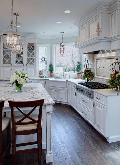
Just look at this traditional kitchen, featuring snowy, white cabinets paired with off-white granite countertops. Like River White granite, these surfaces feature a whitish background brushed with gray veining and dotted with darker tones. The look is grounded with deeply-grained dark wood flooring. While the overall appearance remains light and airy, the granite adds enough visual interest to keep a tonal space from becoming too monochromatic.
Design Tip #2: Make it Pop with Contrast
Pairing white countertops and cabinets is a no-brainer. The look is timeless and presents a clean, open space to your guests. However, you might want a bit more drama in your design, and this can easily be accomplished by turning up the dial on contrast.
In other words, you might want to try pairing white granite countertops with darker cabinets, as in this modern, beach style kitchen.
While white cabinets around the perimeter of the kitchen have been paired with dark countertops, the massive island stands out thanks to alternating contrast, with a creamy granite countertop and darker cabinetry underneath. What ties it all together is the fact that some of the warmer hues in the granite have been mimicked elsewhere in the room.
Note, when creating rooms with contrast, you have to be mindful of degrees of separation. Black and white kitchens make for daring editorial looks, but living in such a jarring space could be too much to take in all the time. This is why you should consider the visual transitions cleverly employed in this space.
By drawing on the warmer notes in the granite, the homeowner has added light wood flooring, a sandy, golden wall color, and a mid-tone backsplash that creates softer transitions between light and dark surfaces in the room. This is not only pleasing to the eye, but it helps to generate a more inviting ambiance for your family and guests.
Design Tip #3: Warm vs. Cool Hues
With granite, you’ll find a wide range of lighter tones to choose from, with samples that are just a touch off white, to those that have cooler, gray tones, to creams and even golden hues that really warm up your space. When it comes to your overall design, a good place to start might be by deciding if you want to lean toward the cool or warm end of the spectrum. This could help to determine what you pair with your countertops.
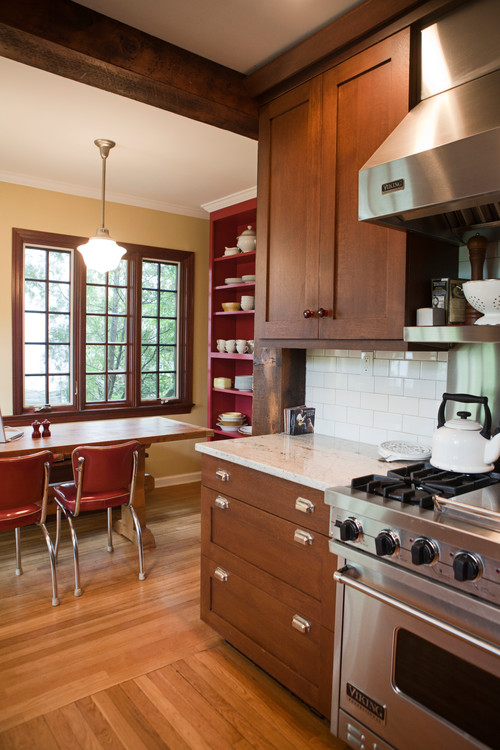
Consider the warm and welcoming atmosphere of this New York kitchen, featuring a creamy granite offset by a white subway tile backsplash. The countertop is complemented by medium-tone wood cabinets and a slightly lighter wood tone for flooring that draws on the subtle splashes of warmth in the granite.
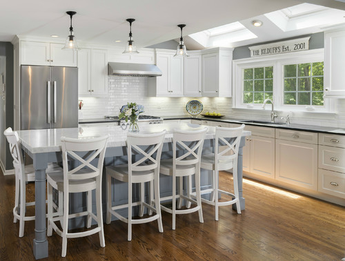
On the other hand, you might prefer the calming serenity of this transitional Connecticut kitchen, with a stunning granite countertop in white with gray veining, paired with dove gray cabinets below and matching gray paint on the walls. With stainless steel appliances and the perimeter of the kitchen done in white cabinets, dark counters, and a white subway tile backsplash, the overall effect is peacefully cool, but not cold.
When it comes to white countertops, granite is definitely an option worth considering, especially with so many variants that can help you to get the lighter look you love with an added dose of dimension and drama built in.
Ready to Design Your Kitchen?
With so many options to explore, you can design a gorgeous kitchen using white granite. We would love to help you pick the countertop material for your next kitchen installation or renovation project. To request a complimentary consultation with one of our design experts, click here.


